For the private viewing

The work arrives before you do.

Provenance, condition, exhibition history, and the wall it would hang on — in one link that lets the work carry the room.
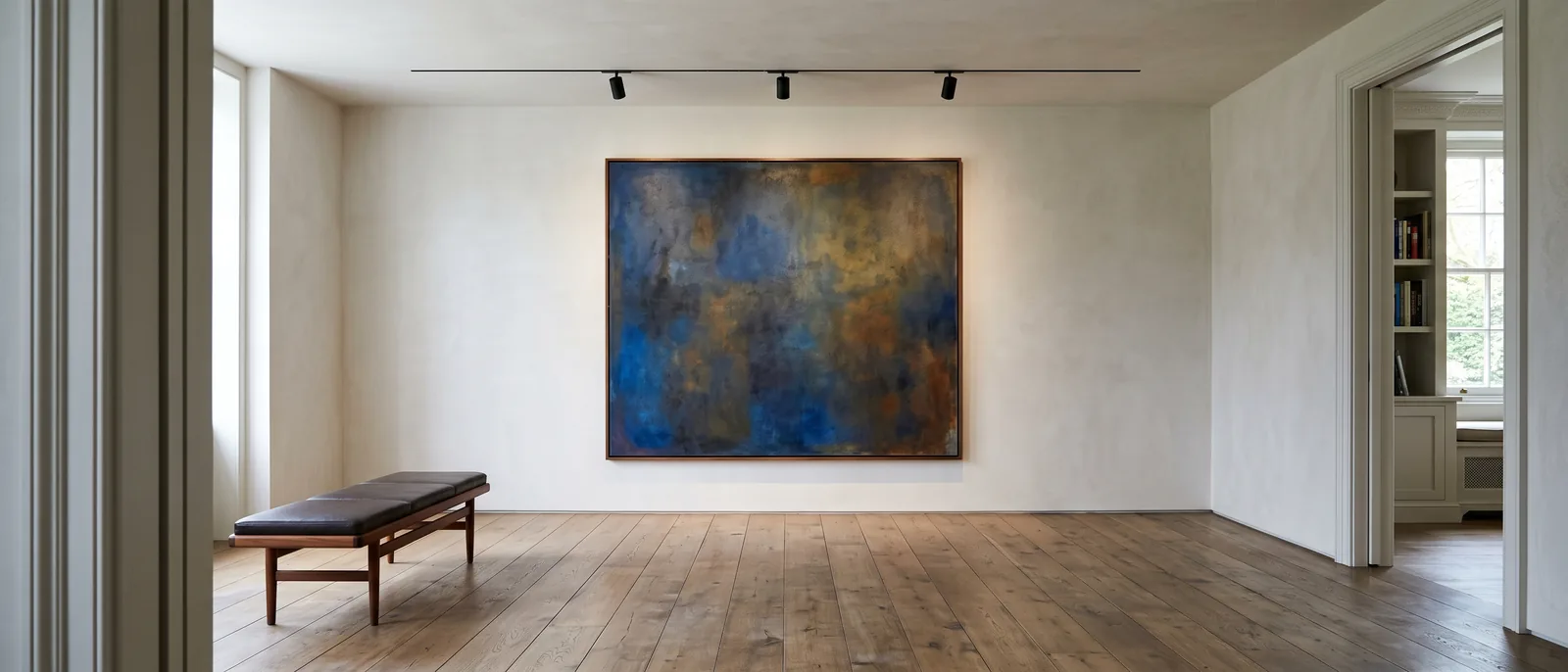
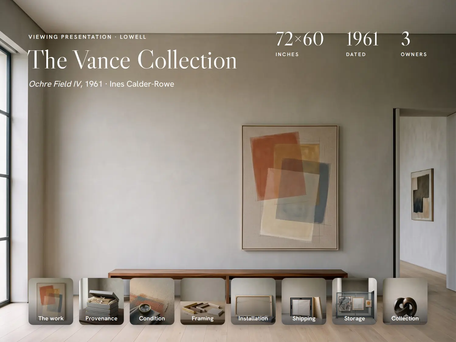
A quiet private gallery room — a single large abstract canvas lit from above on a pale plaster wall, a walnut bench on a wide-plank oak floor.
The Vance Collection — Classic, built in PitchBoards.

Classic

Built in PitchBoards

The Vance Collection

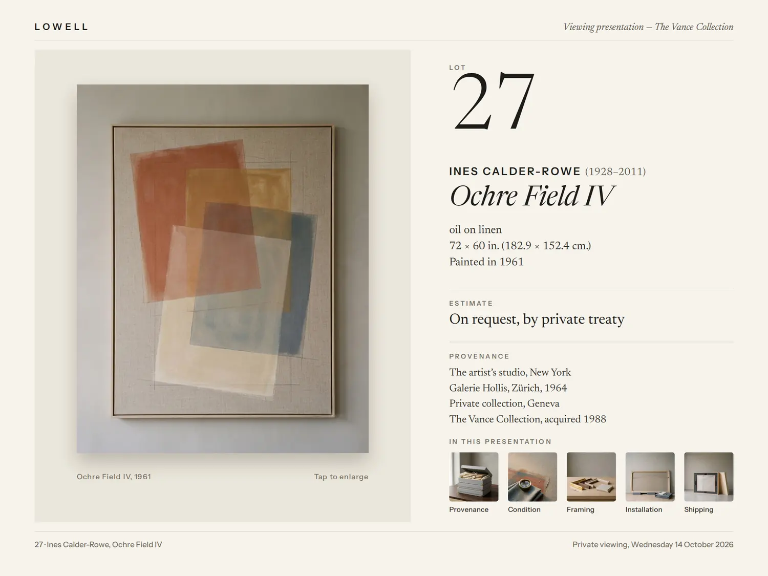
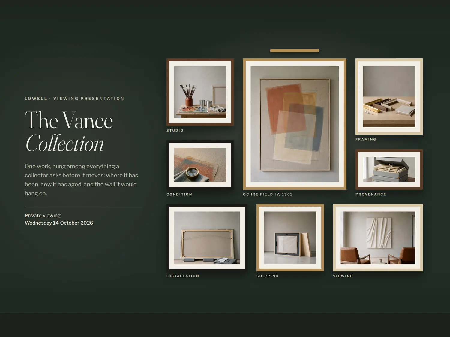
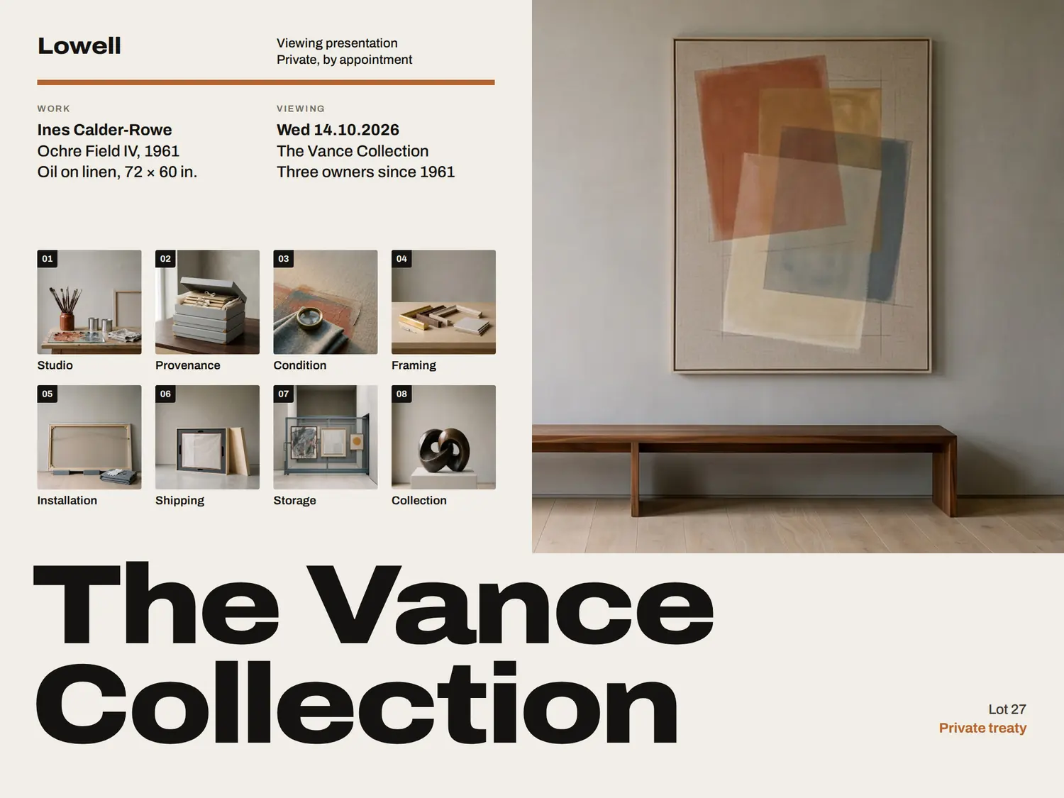
4 boards for one placement, made in the same app you would use — every name and figure on them is sample content. Present them on the iPad at the private viewing, or send the same board as a link.

Open the live board (opens in a new tab)
Real estate first, fine art advisors next. PitchBoards was built for real estate, and that is where it is most worn in. The app, the sharing and the branding are identical for fine art advisors — what is still being shaped is the starting content for your trade. Early users get that shaped around how they actually pitch.

For the collector

Every story this work needs to tell.

Provenance, literature, exhibition history, condition report, and the installation view. One board, no attachments.
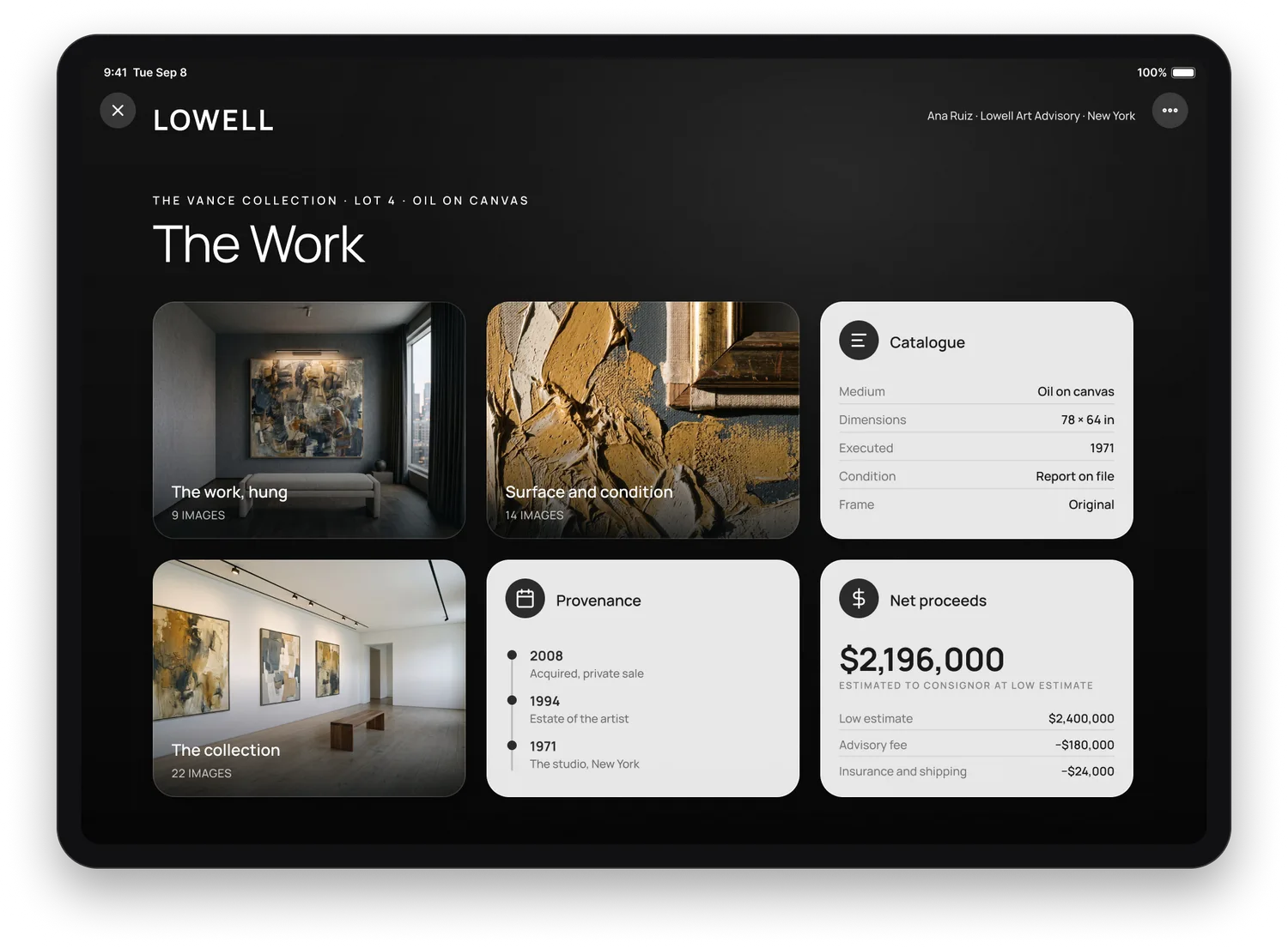
A destination opened inside the viewing presentation on an iPad: photographs of the work hung, its surface in raking light and the wider collection, beside a catalog card, the provenance and an estimate of the consignor's net proceeds.

For the collector and their advisor

The link they open at home before they commit.

Send it once. It opens anywhere, stays current, and holds your brand when it reaches the collection manager.
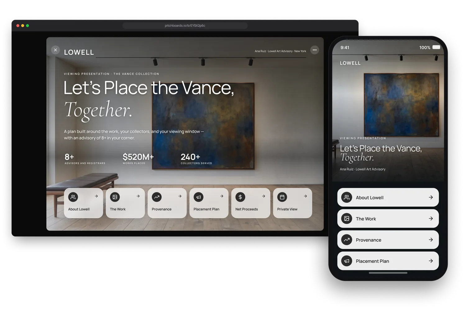
The same viewing presentation opened from a share link in a desktop browser, with the phone version standing in front of it — the board reflowed as a scrolling one-pager, the same headline over the same photograph.

For the whole practice

Every collector sees the same practice.

Your mark, your colors, your type — quiet and identical on every work the practice presents. What changes is the work.
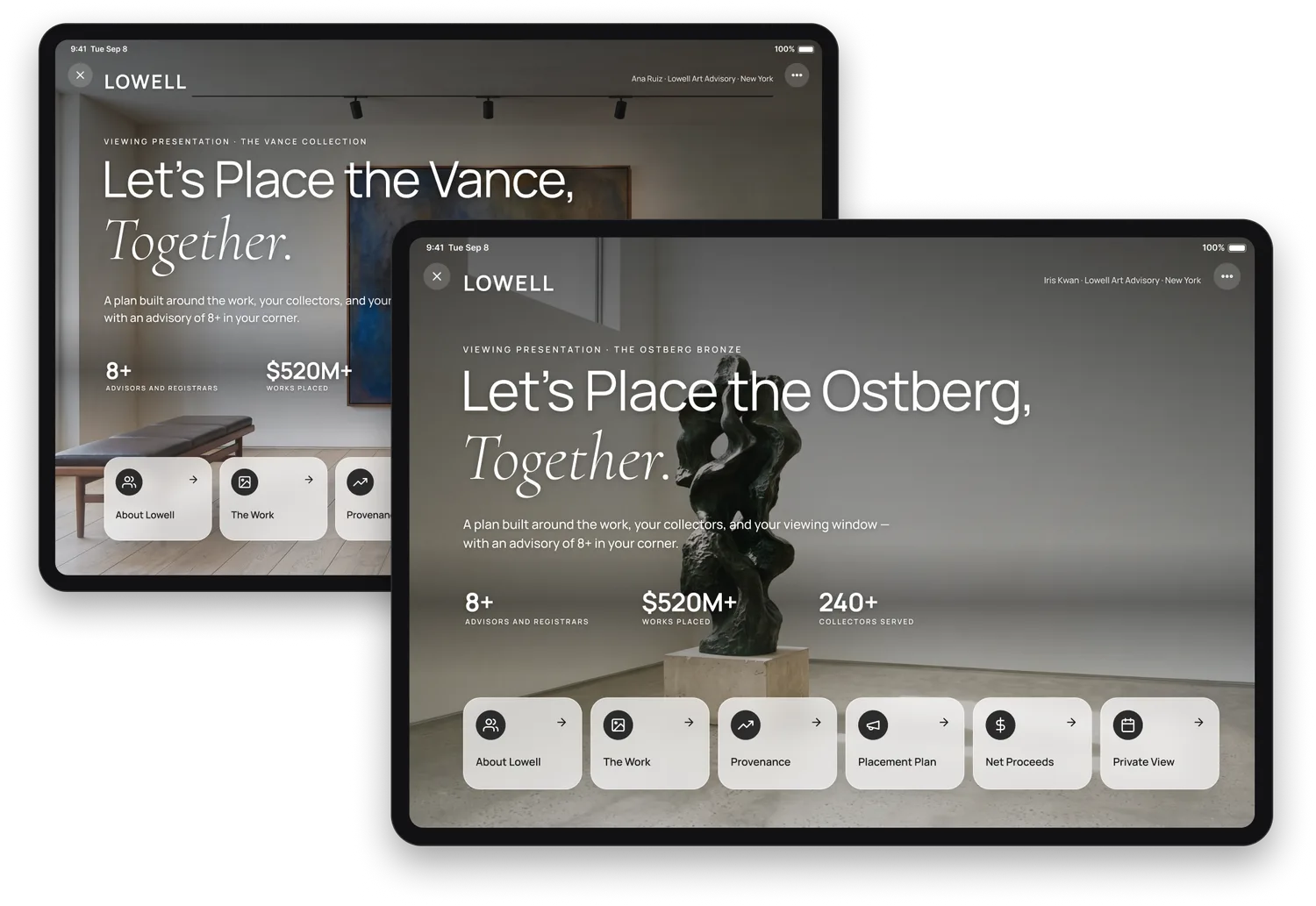
Two viewing presentations side by side on iPads: the same Lowell wordmark, accent and typeface on both — one the Vance collection under Ana Ruiz, the other the Ostberg bronze under Iris Kwan.

Win the next placement.

Type your website. We build your first boards in your brand, and you see them before you sign up for anything.

Other industries